Woodside
Services
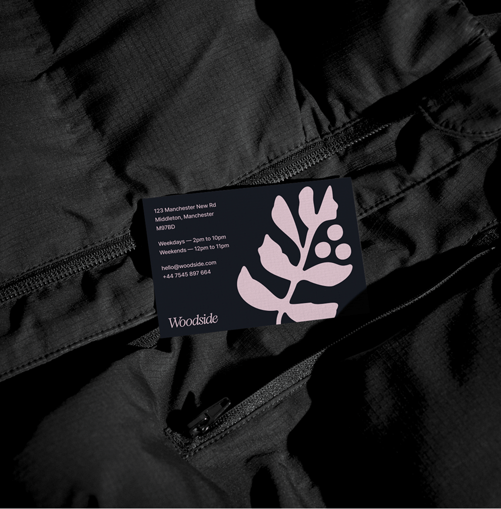
Brand Identity
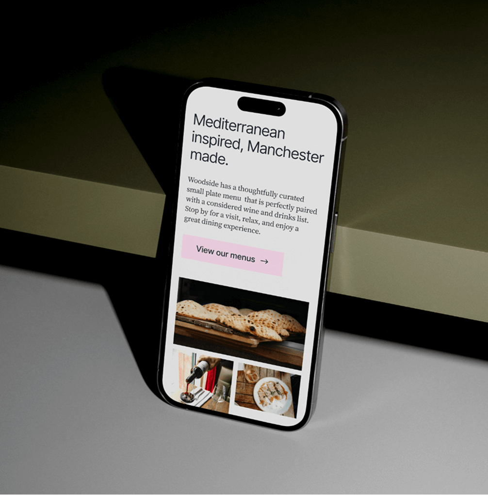
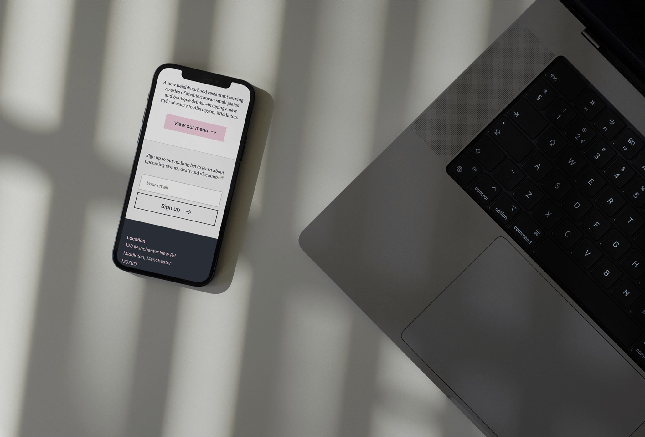
Strategic Website Design
Custom Webflow Build
Website Optimisation
Overview
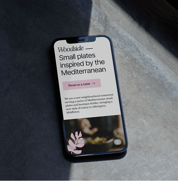
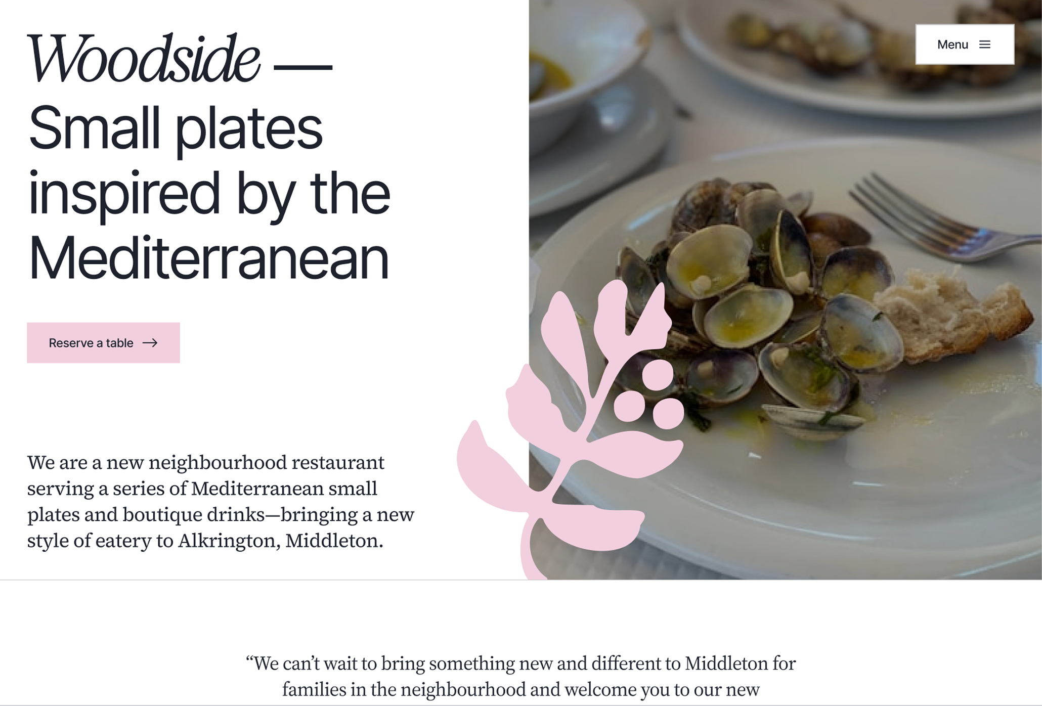
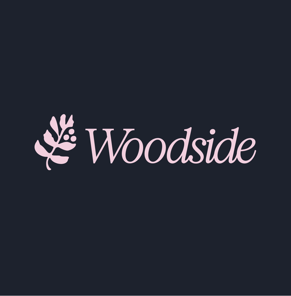
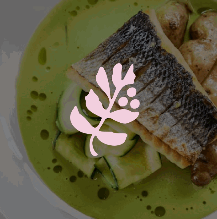
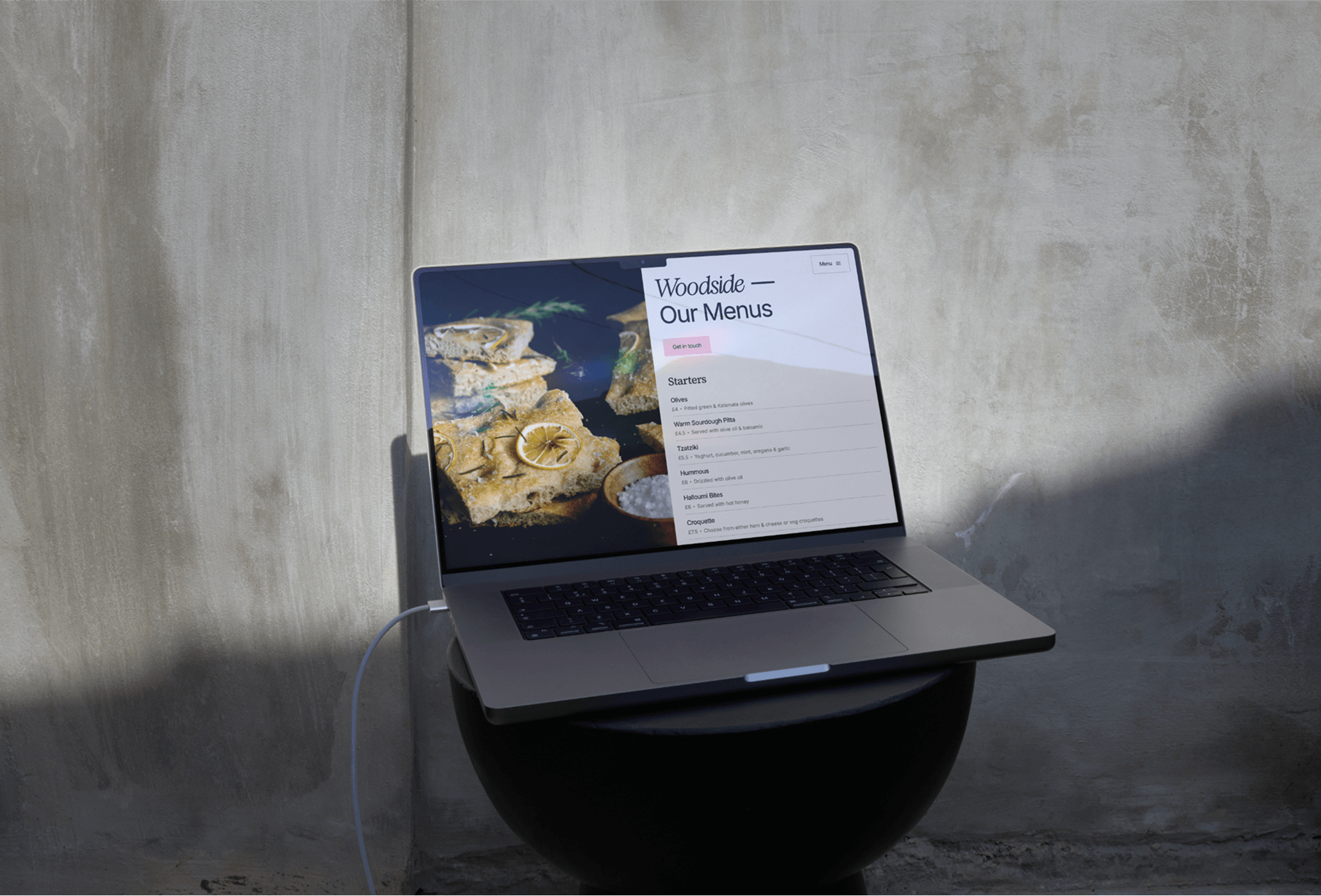
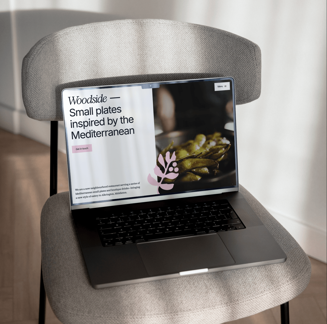
I partnered with Woodside, a Mediterranean restaurant in Manchester, to create their brand identity and custom website in a two month sprint. The basis of the custom brand mark is to reflect the nearby plants found in the local park, Alkrington Woods, thier namesake. The website's design is based around creating space for the focus to be on booking a table. Since opening in 2025, Woodside has been welcomed by the community as a place to gather with friends and family, with majority of bookings coming through the website, Open table, and Instagram integrations.